The Dark Clouds emerged over a decade ago on a lark. The supporters group founded by handing out pins with a goofy-looking black-silhouetted cloud on them. It was like a secret society. This was 2004 and twelve years later, the Dark Clouds are getting a face, er, cloud-lift. The product of working with Moonboots branding agency in San Francisco, the Minnesota United FC supporters group will unveil their new logo this week.
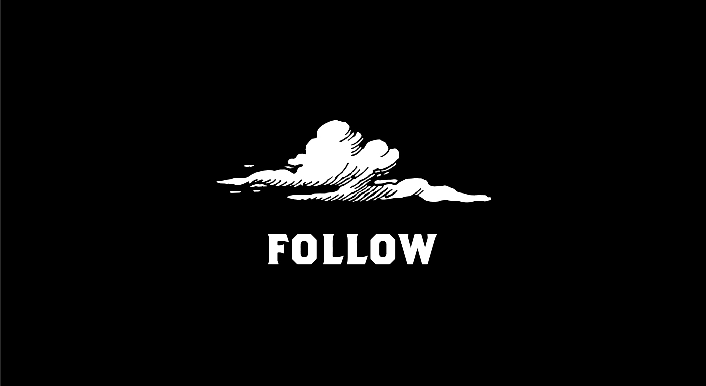
The change might be jarring for some, marking the move from a minimalist, absurdist cloud to what could be described as an 1890s woodcut illustration from a Dickens novel. When asked about this, Dark Clouds President Jim Oliver responds, “I might shave off the ‘Dickens novel’ part of that description for being overly specific, but yeah. The woodcut-like elements give it a handmade flavor that dovetails with that part of supporters culture, but it doesn’t look Olde Timey to me… which is cool.”
The idea driving the rebrand was the theme of “darkness” that came to the forefront as the Dark Clouds theme in 2013 when “Spread the Darkness” became a guiding motto. The new cloud is actually ironically not dark (black) as it was originally and Oliver observes, “A white cloud on a black field still looks like a ‘dark’ cloud which is both hilarious and awesome to me.”
The decision to rebrand was really one of necessity; the Dark Clouds did not own the rights to their own logo. In 2004, after Anthony De Sam Lazaro came up with the name Dark Clouds (as a spoof on hooliganism and the Minnesota Thunder), Bruce McGuire got the idea for an image. He retells the story: “I have a friend in Detroit, Davin Brainard, who incorporates a lot of cartoonish white clouds with blue skies in to his art work. I asked him to make me a black cloud with a gray sky. I got the image and laughed out loud. It was perfect. I had 25 buttons made and at the next game I just walked around passing them out. People were very puzzled. “What the hell is this?” “A dark cloud,” I replied.”
The cartoonish nature of the image was meant to tell people that we didn’t take ourselves too seriously.
The “dark cloud” image was simultaneously iconic and ludicrous, precisely what appealed to McGuire and the early Dark Clouds. He says, “The cartoonish nature of the image was meant to tell people that we didn’t take ourselves too seriously. The whole idea of supporters culture being hard or angry was funny and frankly kind of embarrassing to us.”
That ludicrousness has continued to be a hallmark of the Dark Clouds, who have taken to making tifo (typically viewed as displaying enormous banners) into performance art (such as building 20-foot tall puppets and acting out the disembowelment of a scorpion).
As the Dark Clouds grew in numbers over recent years, though, they have also grown the organization. With that growth, meant the need to professionalize and control things like owning their own brand. Brainard still owned the rights to that dark cloud image. Brainard, however, would not agree to sell the rights to the cloud. Since the supporters group relies heavily upon merchandise to fund its operation, the Dark Clouds board decided they needed a new cloud.
For Oliver, this leads to the inevitably frustrating task: “As the DCs become more of a formal business and charity entity we have to do things like own stuff, not just borrow fun things from artist friends, so that kicks off these processes that take work and thought and time and through the whole thing you’re like “we all like the old thing… can we just keep it?” And we can keep it, it’s not going away, but we need this other thing too now. And now we have it and it’s dope, but it took a bunch of work.”
That bunch of work meant a long process of branding that took, in Oliver’s words, “Foooooooreeeeeeeever.” He explains: “I think it was early in 2015 that we first hired a graphic designer to make us a new cloud and myself and a couple of other board members went through 3 rounds of this guy drawing us a few dozen clouds. Nothing really grabbed us and we finally just paid the guy for his time and threw everything he’d done away. After that it became clear that it was dumb to just show a designer the cloud we’ve been using and say “this, but different,” so we hooked up with a real design and branding firm called Moonboots in San Francisco and started from the beginning… like “what should this logo say?” and “what does darkness look like?” We’ve been going back and forth with those guys since late last year.”
FOLLOW
The change from the original dark cloud certainly marks the end of an era. The Dark Clouds evolved from secret society to a collection of jackasses yelling at the opposition in a quiet stadium, to over 500 members (and non-members) singing in unison. For many long-time Dark Clouds, it is a bittersweet loss of innocence. There was a beautiful joy to the intimacy of the rag-tag group of soccer obsessives, but with it came the utter desperation of looking across the pitch to a bare main stand at Nessie.
Sure it marks the end of an era. But the original look is not dead either.
Is this the same Dark Clouds, then? I put the question to Bruce McGuire: “Sure it marks the end of an era. But the original look is not dead either. It all just goes unofficial now. A new look is long overdue to show the growth and progress the Dark Clouds have made. Its a very different group to 12 years ago. Firstly because we all wouldn’t fit around 1 large table at a bar, and secondly because I don’t know everyone’s name and phone number. Its just different in size, goals, and organization. But the essence is still there. We try not to take ourselves too seriously. And we back our team by any name in any league.
Oliver is, of course, a bit more sanguine. He says, “This is the same old Dark Clouds, hooking people up with beer and food and tickets and giving them an outlet for sports-related creativity and yelling. We’re just gonna have some cool new flags and stuff. People love flags.”
The Dark Clouds have grown exponentially over the last five years and now have their eyes set on entrance to MLS. In 2018, they will take over a 4,000 person standing section of Cloud City, Minnesota United FC’s new stadium. The cloud over that North End will be emblazoned with the single exhortation: Follow.
Leave a Reply