FiftyFive.One

• Voices From Soccer's North •

  • Opinion: Unimaginative Club Identities are the New Scourge of US Soccer

    Alex Schieferdecker

    December 3, 2016
    The Angle
    Opinion: Unimaginative Club Identities are the New Scourge of US Soccer

    The most frequent question about the professional soccer team that plays in Cary, NC, is famously: “what the hell is a RailHawk?” It’s a good question, because there is in fact no such thing as a RailHawk. But at the very least, the name is unique and local. After ten years of use, it is also what passes as historic in the compressed and erratic history of US soccer.

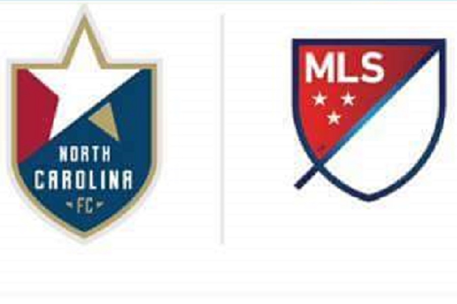
    But in two days, fans in the triangle and across the country will no longer be confused about the name of North Carolina’s best professional soccer team. As shared by Neil Morris, the team will announce a rebrand on Tuesday that does away with the RailHawks name and colors in favor of the name North Carolina FC, the colors of the North Carolina flag, a star, and the shape of the MLS logo. This is the brand identity that owner Steve Malik is hoping will get his team into MLS.

    .@RailHawksFC big news seeping out. Here's their apparent new name – North Carolina FC – logo, with announcement of MLS intentions. pic.twitter.com/mQ5u4RMka0

    — Neil Morris (@ByNeilMorris) December 2, 2016

    We don’t need to spend a great deal of time analyzing the new crest’s elements to say that it’s a very safe choice. Assuming that the leaked image is indeed the actual crest and not a placeholder (because it could easily be a placeholder and that’s not a good thing) the North Carolina FC identity represents the latest in a string of dull and uninspired logos that have swept the US soccer scene. A natural outgrowth of the trend towards European-style names, the wave of dull identities is not the biggest issue in the world, but it sure is annoying.

    https://twitter.com/bornwithatail_/status/804702675518574592

    You might suggest that this is hypocritical from a Minnesota website who fought to keep its team named something Europhillic and boring. But the Minnesota United FC identity is an illustrative example. Eyes rolled when the “United” name was announced. But jaws dropped when people saw the crest. The key feature of the entire team’s identity is the crest element of the Loon, which immediately gave fans something to latch onto. Before the rebranding event had ended, the team had a staid, respectable soccer name, and a nickname around which to begin to build an organic culture.

    This is how they do it in most other parts of the world. Our naming conventions are generally borrowed from England and Scotland, where teams have an official name and a ubiquitous nickname. Often, though not always, that nickname is a central feature of the club crest. This isn’t the only way to do it, but American soccer teams don’t seem to be giving fans any help in establishing common symbols to rally around.

    Take Minnesota’s MLS expansion-mates, Atlanta United FC. After a long public brainstorming process that included intriguing names playing off Atlanta’s history as a railroad hub, its postbellum rebirth from the ashes, and other wild cards like “Black Harts”, the team went the unimaginative route with “United.” But unlike Minnesota’s effort years earlier, Atlanta declined to do anything interesting with their badge. What do we call Atlanta? The stripes? The A’s? The red and blacks? There’s not a lot to work with, and no evidence that fans have made any headway.

    Joining MLS in 2018 are LAFC, who have insisted upon that soporific name since the very start. They’ve since added a very slick new crest, but the central problem remains. What to call this team? The wings? The angels (recipe for a lawsuit)? The Art Decos? Do they inherit “the goats” from the ghost of Chivas USA?

    NYCFC similarly started life with a beautiful but completely unhelpful crest. It didn’t happen immediately, but enough fans have started to call the team “the Pigeons” to give me some hope of that fun, local, and interesting nickname sticking around.

    You can go on an on with this stuff. Louisville City FC. St. Louis FC. FC Cincinnati. San Antonio FC. Puerto Rico FC. Nashville FC. Dull, dull, and dull.

    Only a few clubs have gotten it right. The shining example among them is the Sacramento Republic, which managed to find an official name that was unique, local, and still Euro-sounding. Slap the state flag’s bear on the crest, and you’ve got the makings of a great club identity in the capital of California. Orlando City SC also found success, despite Orlando really being more accurately described as a large suburb. But the addition of lions to their USL crest and the prominent sun/lion on their MLS crest have reinforced the team’s nickname and identity.

    Not every team needs to be the Rochester River Dogz or the Carolina RailHawks. There is a middle ground between a club looking minor league and looking joyless. One great way to do that is to create an identity that works formally and informally. Teams in the US have evidently lost that art, and that’s a shame.


    Boring Crests, North Carolina FC
    Next
    Previous

    29 responses to “Opinion: Unimaginative Club Identities are the New Scourge of US Soccer”

    1. Offensive Loons Fan Avatar
      Offensive Loons Fan
      December 3, 2016

      A couple of thoughts.

      1. I prefer the unimaginative trend lately to the OVERTLY European inspired names like Real Salt Lake and the very recent unveiling of Inter Nashville. Those are unforgivably ridiculous.
      2. Aside from my lovely Loons, I think the Portland Timbers have the best identity in US Soccer. A name that does not bend to European conventions, is particularly local, has a history of its own, and a logo that is (to quote Richard Wright’s statement about the Dark Side of the Moon album cover) “simple and bold”, one that gives fans a starting point around which to grow their own interpretation.
      3. I can’t remember who pitched this, but someone was talking team names once and they mentioned the team name “Rose & Vertigo XI.” I asked them what it meant, and they couldn’t give me a very good explanation but it seemed specifically local. That name has always stuck in my head as a fucking awesome name, for some reason.

      Reply
      1. Scooter Revolution! Avatar
        Scooter Revolution!
        December 4, 2016

        If I’m not mistaken, the Seattle Sounders fans wrote in the “Sounders” name to the chagrin of the MLS.

        Reply
        1. Dave DuJour Avatar
          Dave DuJour
          December 5, 2016

          I think so too. I remember some discussion of changing the Sounders name when they moved to MLS, but the fans vetoed it. Which I think is good. The Sounders name has a long history in Seattle and it should be kept.

          Reply
      2. Alex Schieferdecker Avatar
        Alex Schieferdecker
        December 4, 2016

        The Timbers identity is unbeatable, I agree.

        Reply
      3. Rory Gates Avatar
        Rory Gates
        December 4, 2016

        To think The Oregonian write-in contest ended with Pioneers in 1975. They decided against it because of a local university had the same nickname. Went with Timbers, which had some votes.

        Reply
    2. Scooter Revolution! Avatar
      Scooter Revolution!
      December 4, 2016

      When I lived in Pittsburgh the question was often “We have a professional soccer team?” followed by “What’s a Riverhound?” A “Riverhound” is slang for someone that works in and on the rivers that define Pittsburgh – it’s actually “River Dog” but that name was already taken. They are just about ready to celebrate 20 years too!

      It’s local, it’s is part of the make up of the city and historical. If and when Pittsburgh ever gets a MLS team (they already own their own stadium in the heart of downtown), the “HOUNDS” would still be a better name than FC or City or United.

      Trying to rebrand a product is not always a good thing.

      Reply
      1. Gerson22 Avatar
        Gerson22
        January 1, 2017

        Pittsburgh was the Riverdogs, but the Charleston Riverdogs minor league baseball team had a conniption about it, so they changed it.

        Reply
        1. Scooter Revolution! Avatar
          Scooter Revolution!
          January 29, 2017

          I remember it well. 🙂

          Reply
    3. Brian Quarstad Avatar
      Brian Quarstad
      December 4, 2016

      But do you guys remember the first MLS Timbers logo flop?
      http://www.insidemnsoccer.com/2010/06/14/portland-timbers-new-logo-cut-down-by-passionate-supporters/

      Reply
      1. Alex Schieferdecker Avatar
        Alex Schieferdecker
        December 5, 2016

        They’ve sure moved smartly away from that.

        Reply
      2. Kevin Joseph Avatar
        Kevin Joseph
        December 5, 2016

        If by “flop” you mean complete overreaction by fans, sure.

        Reply
      3. PaleVermilion Avatar
        PaleVermilion
        December 5, 2016

        Wow. Kevin said it right. Complete overreaction. I wish I would’ve been following the MLS back then to react in real time. I remember when I first saw the crest I loved it.

        Reply
    4. M. Rafferty Avatar
      M. Rafferty
      December 5, 2016

      How about Reno 1868? Dates as nomenclature is unique to North American soccer. It was even the winner of a fan vote contest, thankfully beating out “Reno FC” and “Reno United FC”.

      We don’t have a mascot/theme yet but they have left it open to us to come up with that organically.

      Reply
      1. Brian Quarstad Avatar
        Brian Quarstad
        December 5, 2016

        I like it. Not sure about unique to North American. How about TSV 1860 Munich?

        Reply
        1. M. Rafferty Avatar
          M. Rafferty
          December 5, 2016

          Sorry, I kind of misworded that. I didn’t mean to say it’s only in NA, but that it is a unique nomenclature within NA.

          Reply
        2. Mitch Avatar
          Mitch
          December 5, 2016

          But 1860 doesn’t call themselves, 1158 Munich (the year the city started), the just include the founding year in the club name which is common in Germany. Reno 2016 would at least make sense.

          Reply
          1. M. Rafferty Avatar
            M. Rafferty
            December 5, 2016

            Exactly, that’s why city founding is unique. It’s taking an old tradition and throwing in our own flair

            Reply
      2. Alex Schieferdecker Avatar
        Alex Schieferdecker
        December 5, 2016

        I like Reno 1868. Would’ve liked a better badge though. A pickaxe, something more expressive than a mountain and a stream.

        Reply
      3. Kevin Joseph Avatar
        Kevin Joseph
        December 5, 2016

        If I remember right, “Silver” was also one of the options. I still think “Reno Silver 1868” would be a cool name.

        Reply
        1. M. Rafferty Avatar
          M. Rafferty
          December 5, 2016

          Yeah “Reno Silver FC” was the only semifinalist I was for aside from 1868. And “Reno Silver 1868” or “1868 Reno Silver” would be good choices as well

          Reply
      4. Mitch Avatar
        Mitch
        December 5, 2016

        I hate the name, 1868, it’s complete nonsense. It’s just taking a German-esque name and pretending it’s unique. Reno Silver would have been tight or pretty much anything else.

        Reply
        1. M. Rafferty Avatar
          M. Rafferty
          December 5, 2016

          ANYTHING else?

          But yes, 1868 is unique. No NA soccer club uses dates and no club in the world uses city founding year. And for the record it would have been officially “Reno Silver FC” so the Euro name would still be there.

          I have a couple honest questions, not trying to put you on the spot:

          1) What name would you go with for Reno? Doesn’t have to be any of the finalists?

          2) Do you hate every Euro-ish name equally? Every FC, United, City, Real?

          Reply
        2. Gerson22 Avatar
          Gerson22
          January 1, 2017

          No, genius, “Reno 911” would have been complete nonsense.

          “Reno 1974” would have been complete nonsense.

          You know the significance of 1868 to Reno, right? Or are you just talking out of your ass?

          Reply
    5. Kevin Joseph Avatar
      Kevin Joseph
      December 5, 2016

      The even bigger sin, in my eyes, is that they’re going to ditch the orange. They made orange their thing for ten years, and now they’re going to throw it away.

      People spend a lot of time lamenting the lack of history in American soccer…. and then throw away their history to be more “Euro”.

      Reply
      1. JoseAmerica Avatar
        JoseAmerica
        December 7, 2016

        Amen. I hated the “Railhawks” logo and name, but I loved the orange.

        And they’re ditching it for red, white, and blue? Tragic.

        Reply
    6. Alex Schieferdecker Avatar
      Alex Schieferdecker
      December 5, 2016

      I like what you’ve done!

      Reply
      1. M. Rafferty Avatar
        M. Rafferty
        December 5, 2016

        Thank you! We had a name and logo contest, lots of creative entries. The name won by a large margin. The logo, created by one of our founding members, won against other really great ideas. Some of them were military-themed with Civil War imagery which is appropriate (Battle Born state), but I’m glad we went the direction we did

        Reply
    7. DrPlacebo Avatar
      DrPlacebo
      December 5, 2016

      Sacramento Republic FC may have a bear in its crest and a few fans who show up in bear suits, but the most common nickname seems to be “the Quails” — which started out as an April Fool’s press release about a new crest and new mascots, and then took on a life of its own.

      Reply
      1. Scooter Revolution! Avatar
        Scooter Revolution!
        December 14, 2016

        Which is wonderful! That’s what a soccer community is all about. Officially you be Republic but a great nickname builds the community. I like the Quails

        Reply

    Leave a Reply Cancel reply

    Your email address will not be published. Required fields are marked *

Subscribe to Our Newsletter!

Lorem ipsum dolor sit amet, consectetur adipiscing elit, sed do eiusmod tempor incididunt ut labore et dolore magna aliqua.

Subscribe Now

Recent Posts

  • Miguel Ibarra’s My Friend: The end of an era in Minnesota
  • Photo Gallery: Minnesota United FC Loses First-Ever Playoff Match
  • Matchdays Twenty-Nine Through Thirty-Four: Playoff Spotlight
  • Photo Gallery: MNUFC Draws LAFC In Final Home Match
  • MINvLAFC Open Game Thead

Copyright © 2023 FiftyFive.One

Design by ThemesDNA.com